I recently went to a big Microsoft Windows 8 developer event at the Mountain View Microsoft office and I heard for the first time a really good explanation for why Metro is, well the way Metro is. One of the original UI architects spoke and made this argument that I’ve never heard before. I’ll try to do my best to recall what he said with making too much up so here it goes.
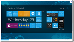
He said that with one of the first Metro UI builds that basically looks like the current Metro interface, Microsoft brought in a bunch of people for a study. They asked them sit in front of a class Windows Desktop and do a bunch of stuff, then sit in front of a Metro interface and do some stuff. In other words, basically here is what they were looking at:
versus
(sorry about the size differences, that’s not really relevant here)
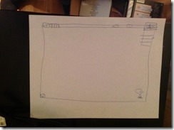
Microsoft then asked the participants to draw what they remembered from each interface. For Window classic, they drew the following:
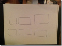
For Metro, they drew this:
Microsoft’s conclusion was that Metro is all about the content and Windows class is all about the stuff around the content. It seems obvious that the OS should be about the content and not the plumbing.
So, there you have it, with the exception of one thing (which is actually what’s motivating this post).
The Problem
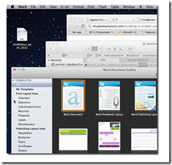
Unless you have been living under a stone, I think we all know that the Apple OSX operating system has been getting more and more popular. it’s design is even further away from the windows class desktop. That is, not only to the launch places have to do with edges and corners, the menu itself is glued to the top no matter what program you are running.
I recently noticed this article posted that showed that in full detail:
http://macwinguy.com/2012/04/where-did-my-menu-go/
It shows that the mac window all about edges.
So, there you have it. I’m now perplexed.


